fifa world cup 26 - MASCOTS
This is the final project I led at The Mill… and maybe the most high-profile.
FIFA invited us to a competitive pitch — the best design studios in the world submitting concepts for the new World Cup mascots.
We won that pitch.
In the months that followed we worked with the FIFA organisation to develop a set of characters that would represent the 2026 World Cup EVERYWHERE — from stadiums to shirts to soft toys.
BACKGROUND
The concept that won this pitch was written at my kitchen table at the beginning of 2024. Back then, the World Cup seemed very far away. It was a weird time in my life. My partner was pregnant with our first child and the creative studio I was working for, The Mill, was collapsing under an aggressive corporate takeover. This opportunity felt like a bright light in uncertain times. That might be why we pursued it so vigorously.
STRATEGY
There was strategy to the approach.
World Cup 26 takes place across three nations: Canada, USA and Mexico. I felt that most studios would respond to this with three character concepts, one for each nation, then try to connect them retroactively. I wanted to do something different:
One concept serving all three nations.
It feels like a small distinction but in practice it’s really powerful. By considering the nations as a single bloc we’re acting in the same spirit as the tournament. FIFA’’s job is to promote the whole, not the individual, and if we could do find a design concept to support the bloc we had a good chance of beating anyone trying to glue three country concepts together.
I just needed to find a concept that served these three (incredibly different) nations equally.
A UNIFYING CONCEPT
It wasn’t easy. Despite their geographic proximity, Canada, USA and Mexico are viscerally different. There’s a billion reasons for this, but the most enduring is the way they were colonised by different European powers and the French, English and Spanish influences that fell out of that.
If you step back to a time before colonialism, the dominant cultures on this landmass were specifically American, and they had much in common. Daily rituals were broadly based around interpreting the natural world — with plants, animals and environment playing a central role. These themes are common to all pre-colonial folk art. And one type of folk art in particular was made by peoples across North America.
Which was where I found our concept.
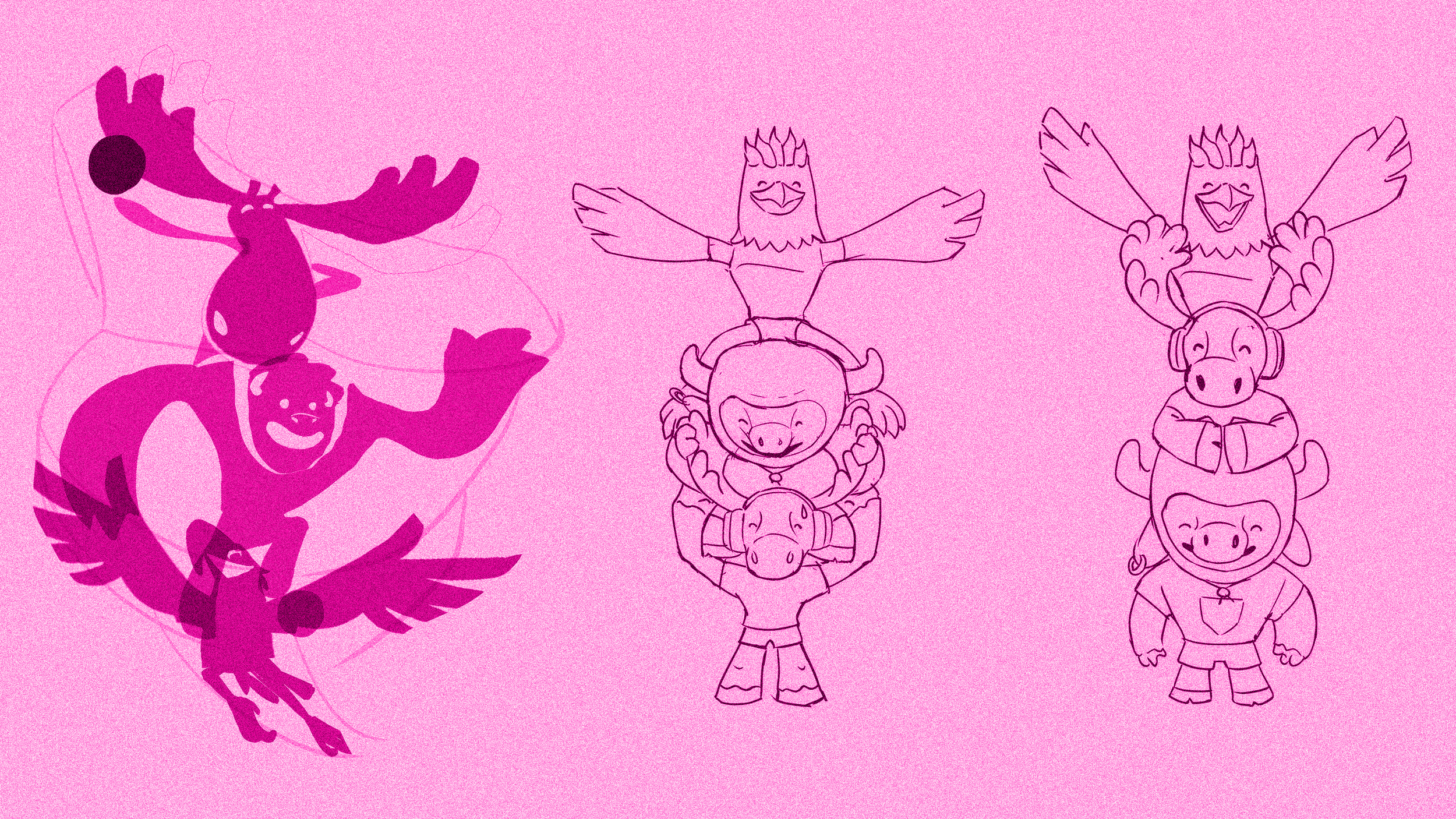
TOTEM POLE
The totem pole is a specifically American art-form. It can be found in various incarnations across Canada, USA and Mexico. It worked amazingly well as our visual concept, offering two big ideas in one:
The pole itself — a single stack of conjoined animals working as a mascot for the North American landmass (and thus World Cup 26)
Three individual animal characters — these could be broken apart to as independent mascots for each nation
It felt strong. Twice the power of a regular idea.
FIFA agreed.
We were in business.

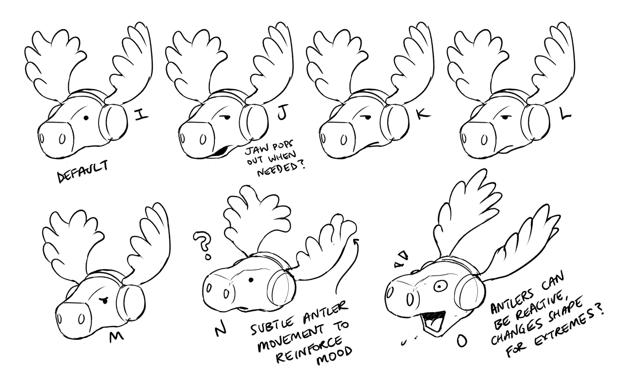
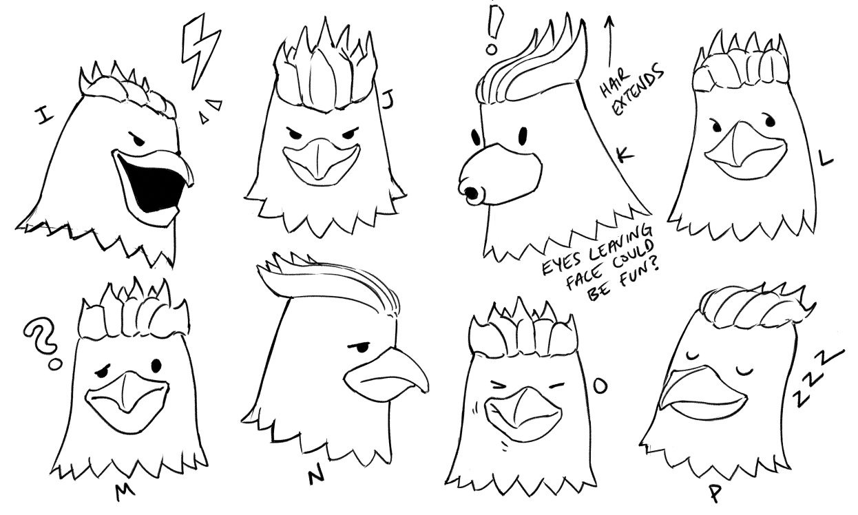
THE ANIMALS
With the concept in place we moved onto the granular details, specifically: aloting each nation an animal. This was, to put it bluntly, a nightmare.
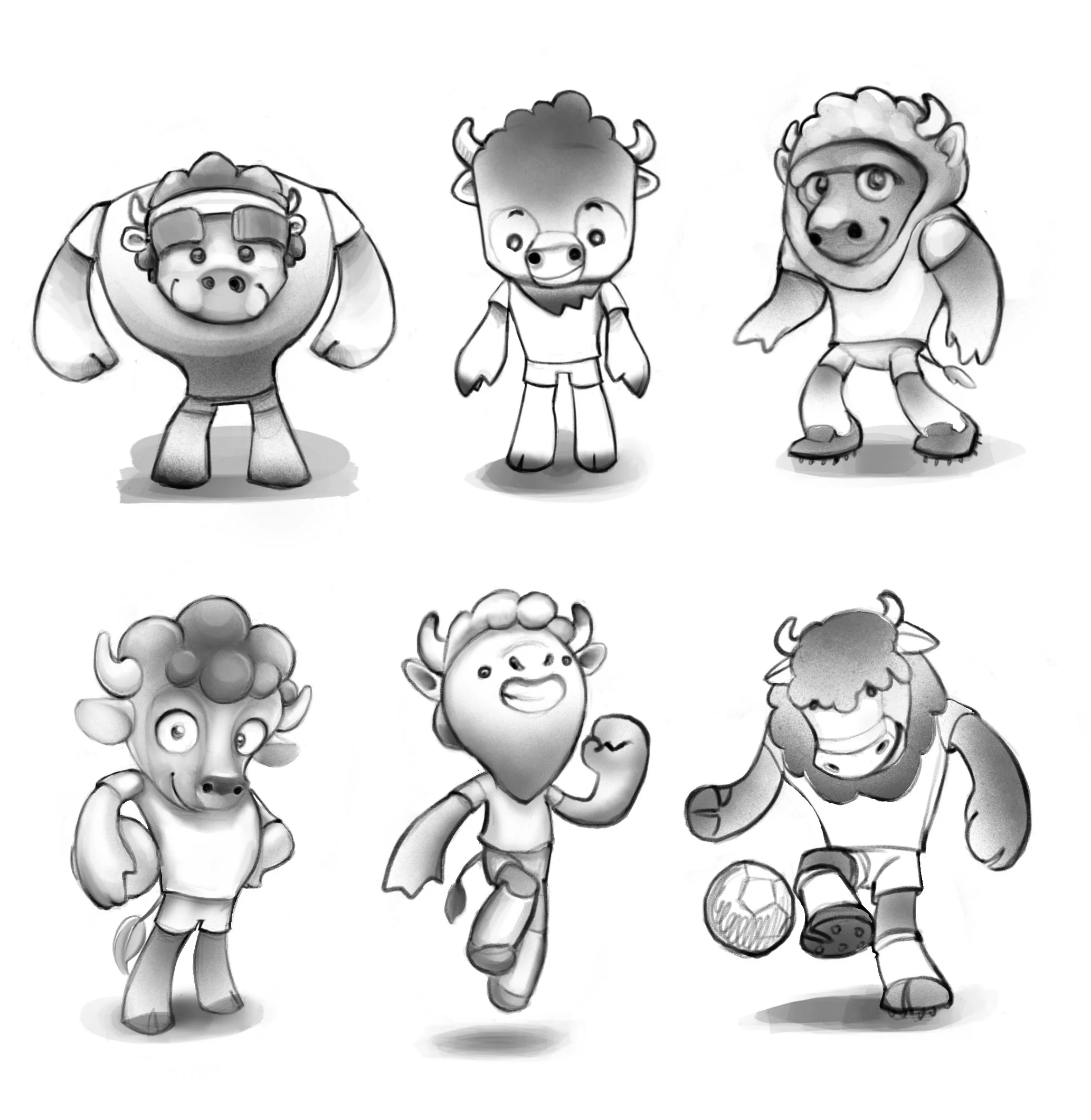
We were full of suggestions. Our original long-list had beavers and snakes and plenty more besides. There was a spider monkey, an axolotl and an Eurasian Eagle Owl… This was a cool task. We were pumped.
The national football bodies, it turned out, were not. The geopolitics of cute animal characters is a serious business. The mascots needed to be cool, powerful and as un-silly as possible. (Sorry beaver.)
With all three nations attempting to claim the Bald Eagle (LOL) we realised we needed to do some serious design development. Luckily we had incredible artists in our team.
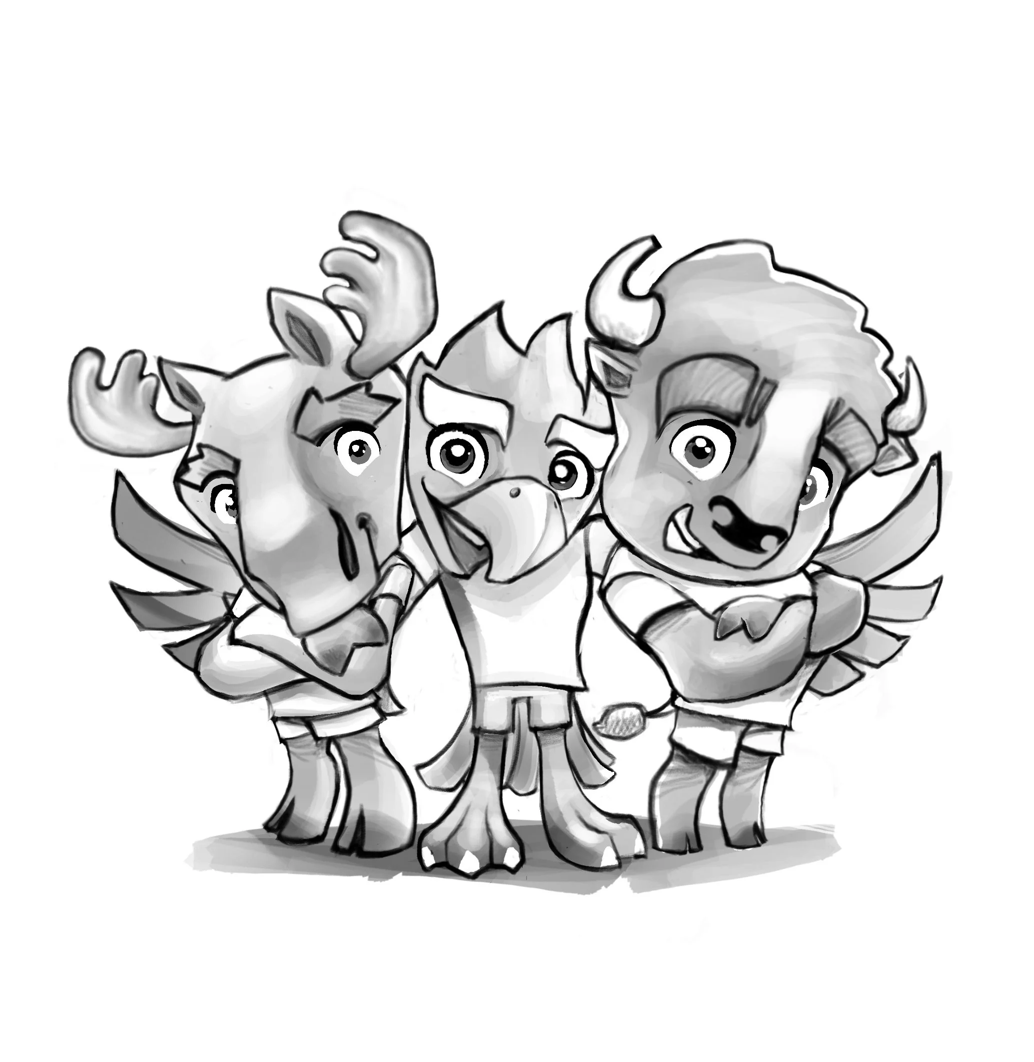
LINEUP
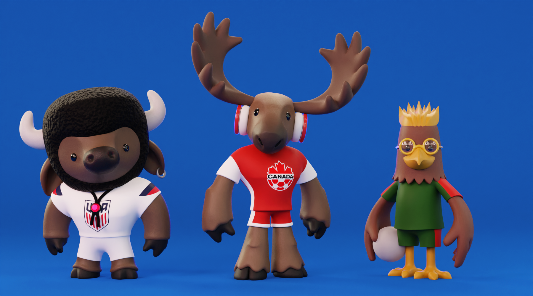
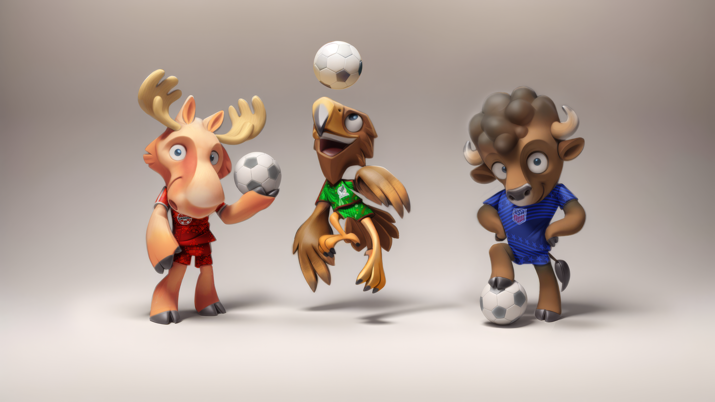
At the end of our first design stage, and after much back and forth with FIFA, we were convinced we had it. Our dream lineup looked like this:
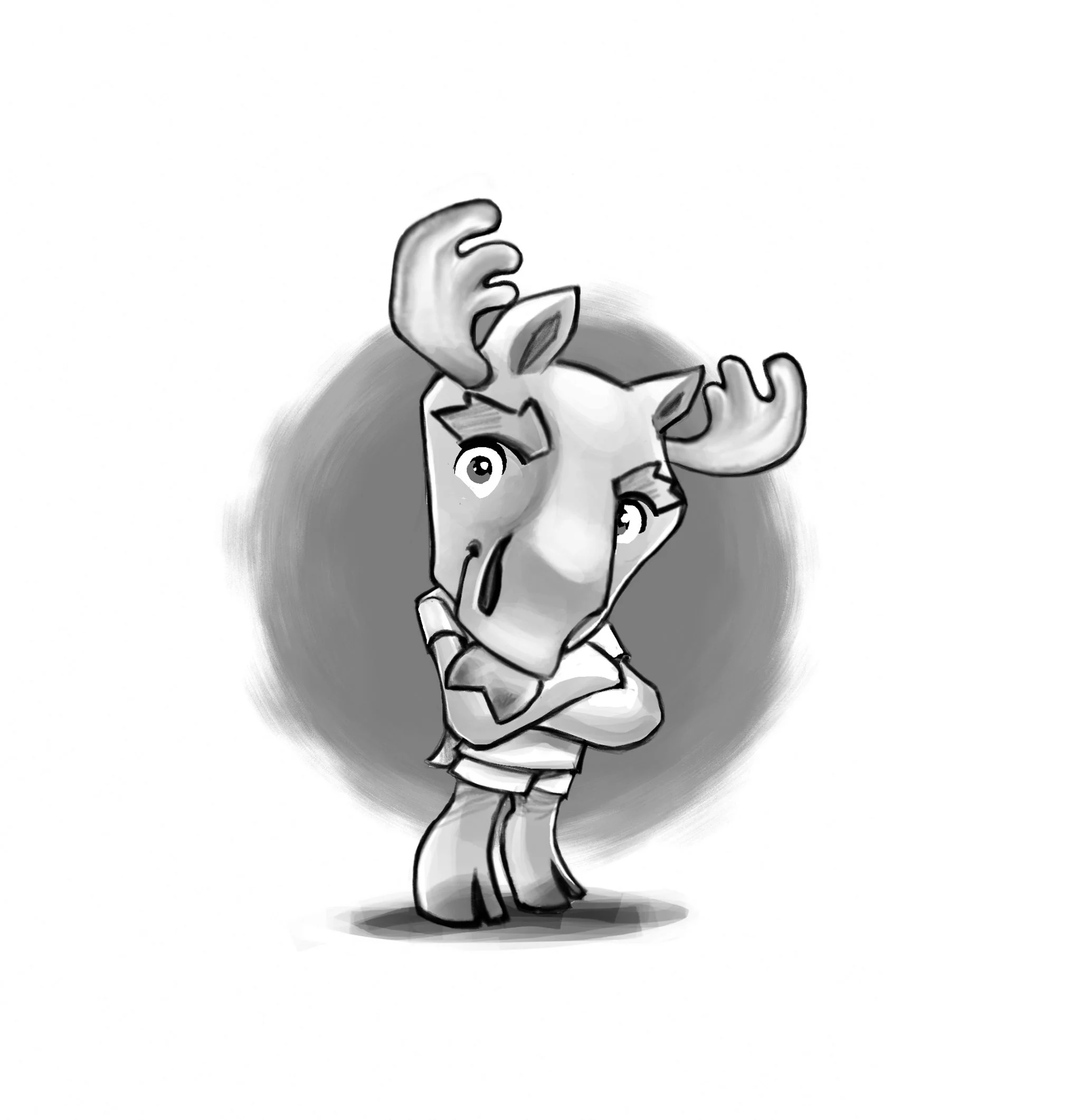
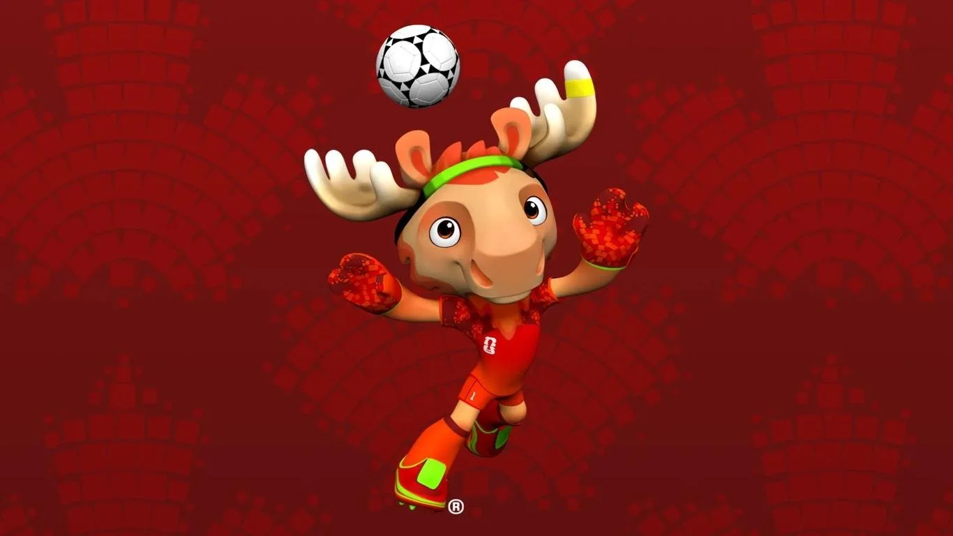
CANADA: Spruce the moose
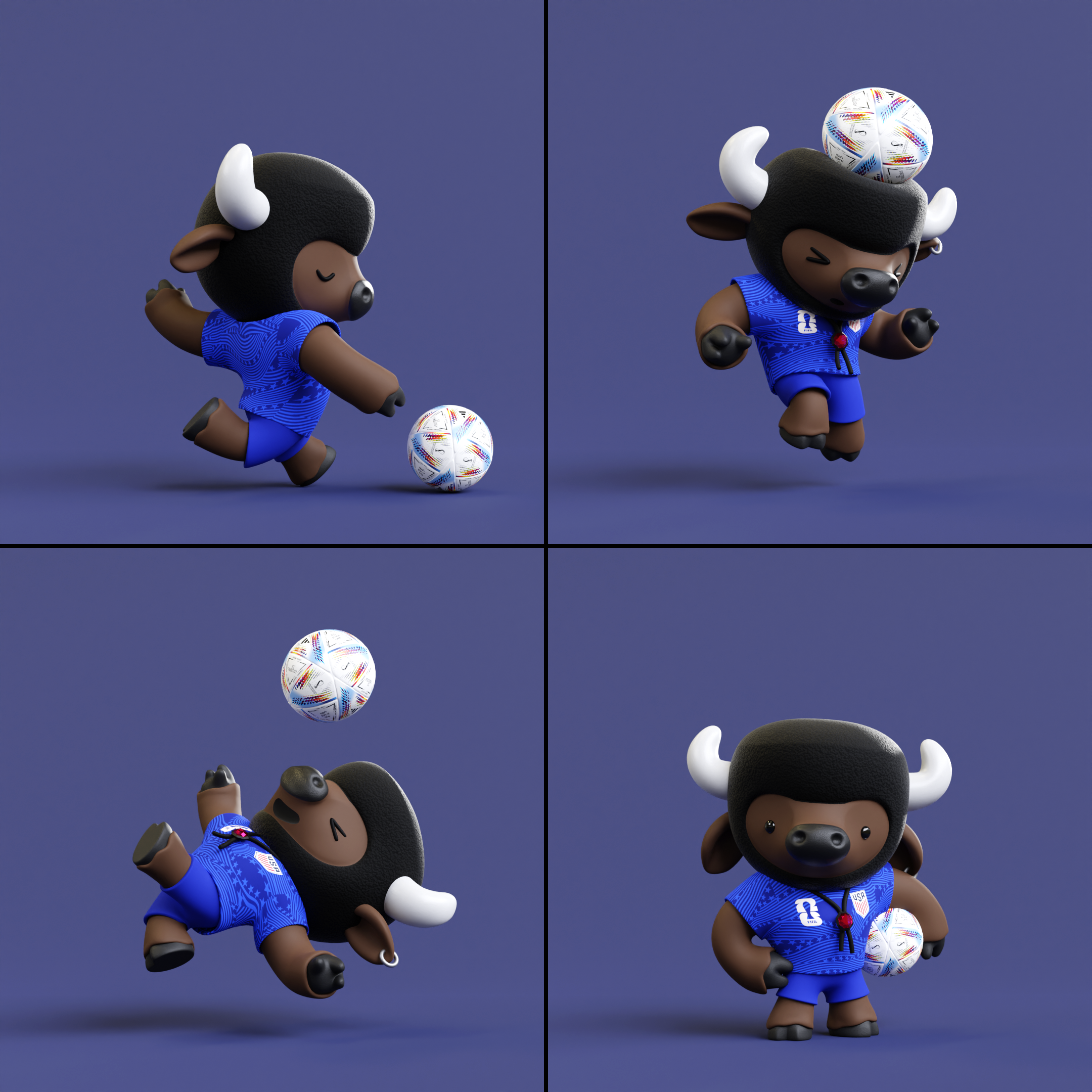
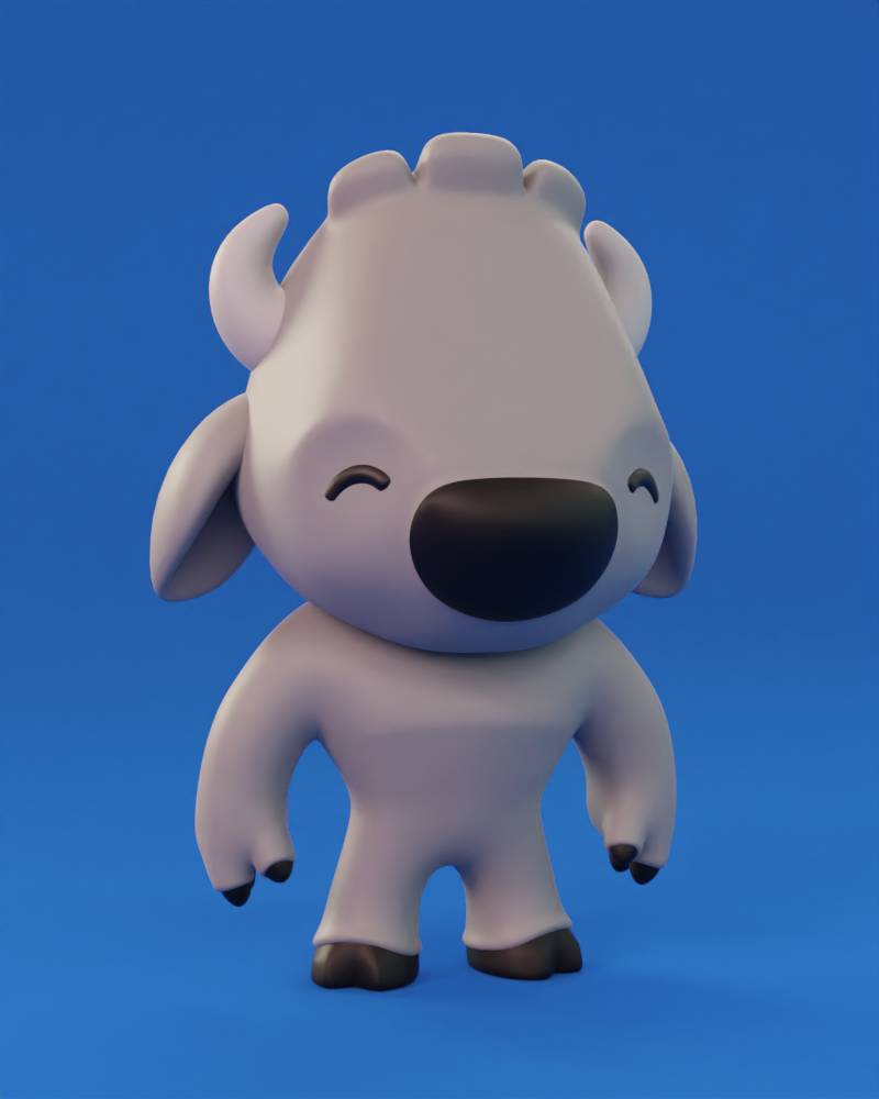
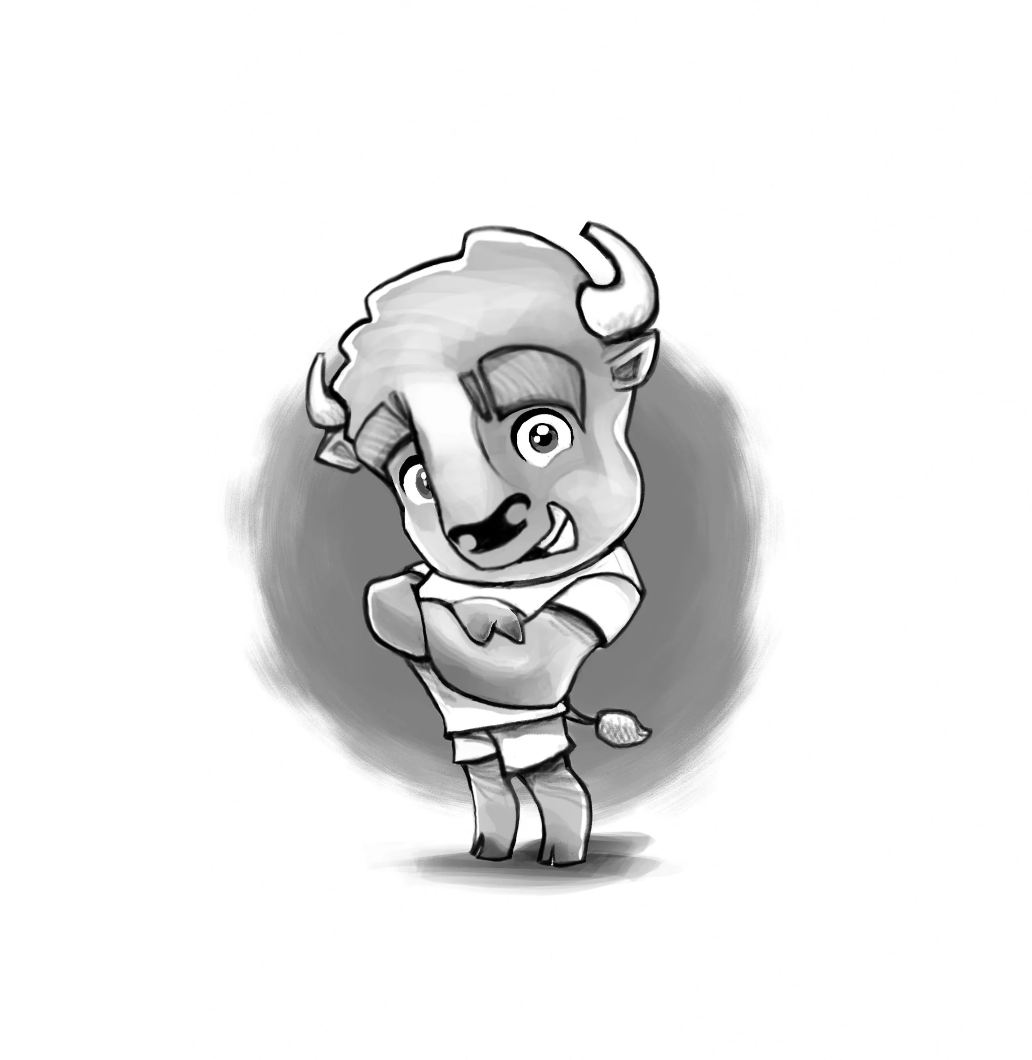
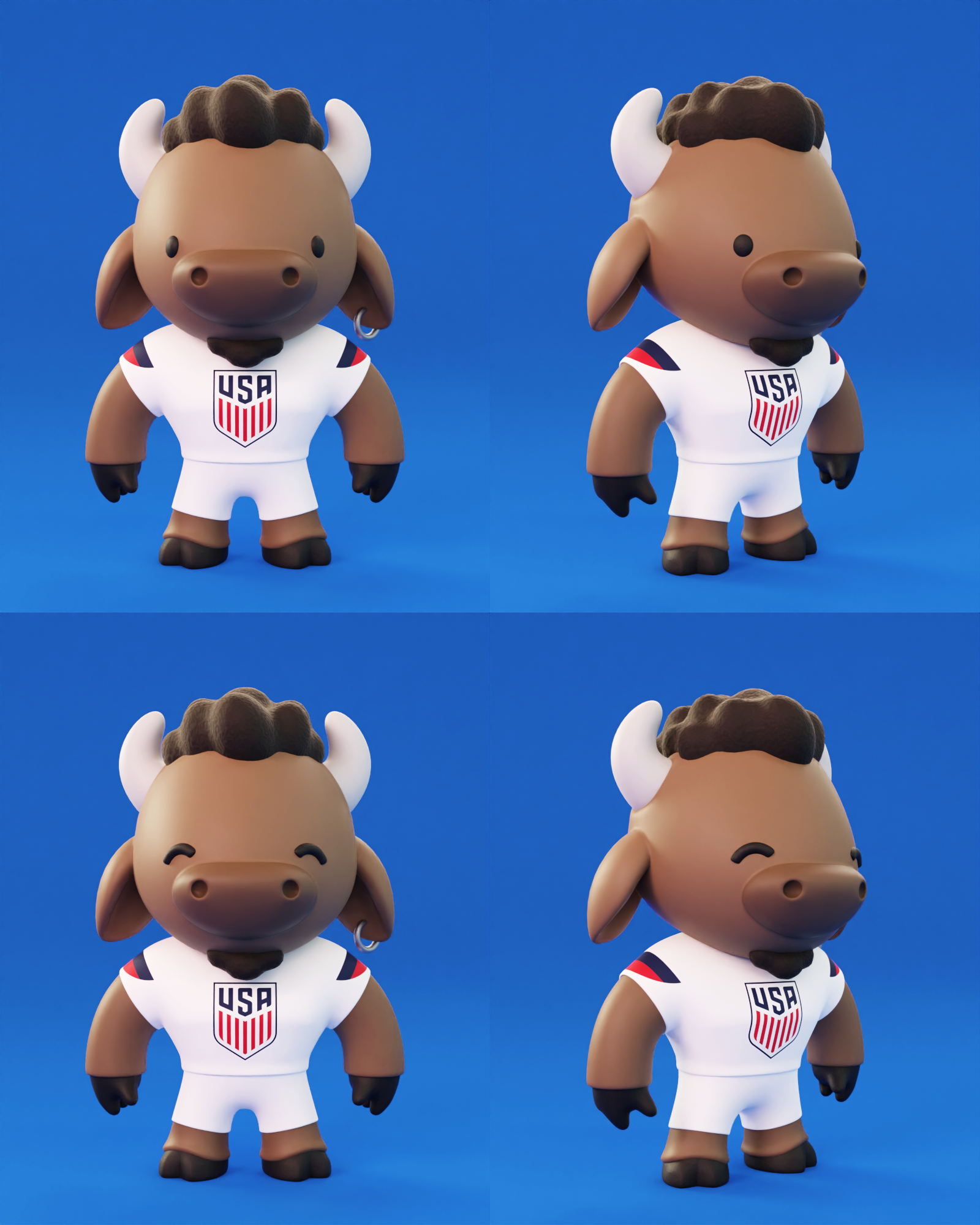
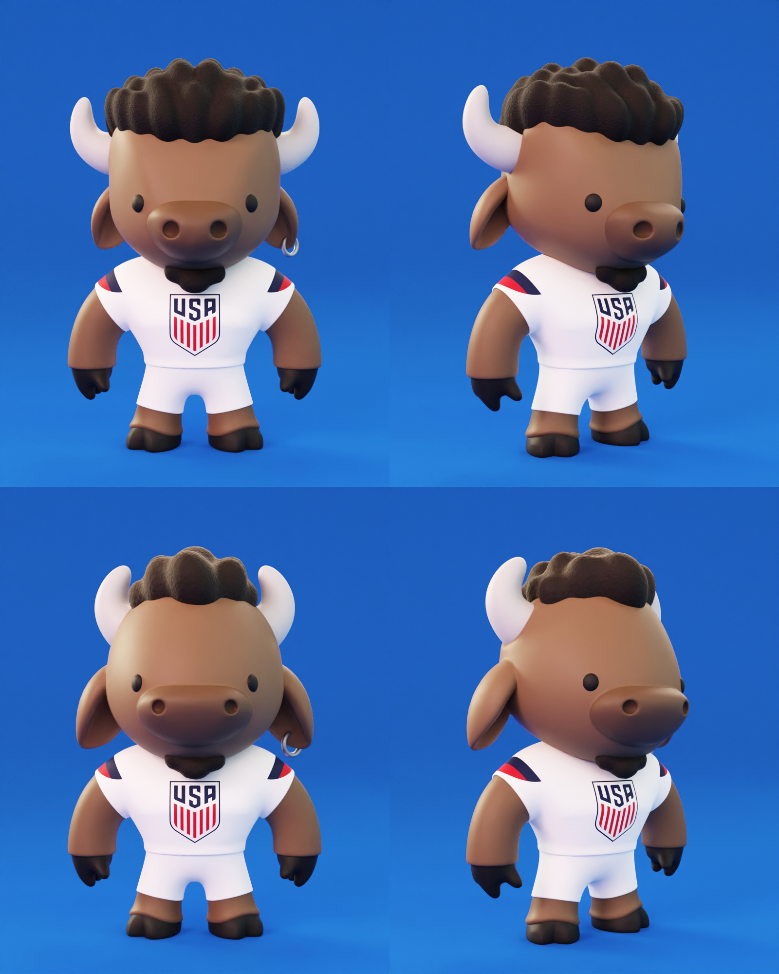
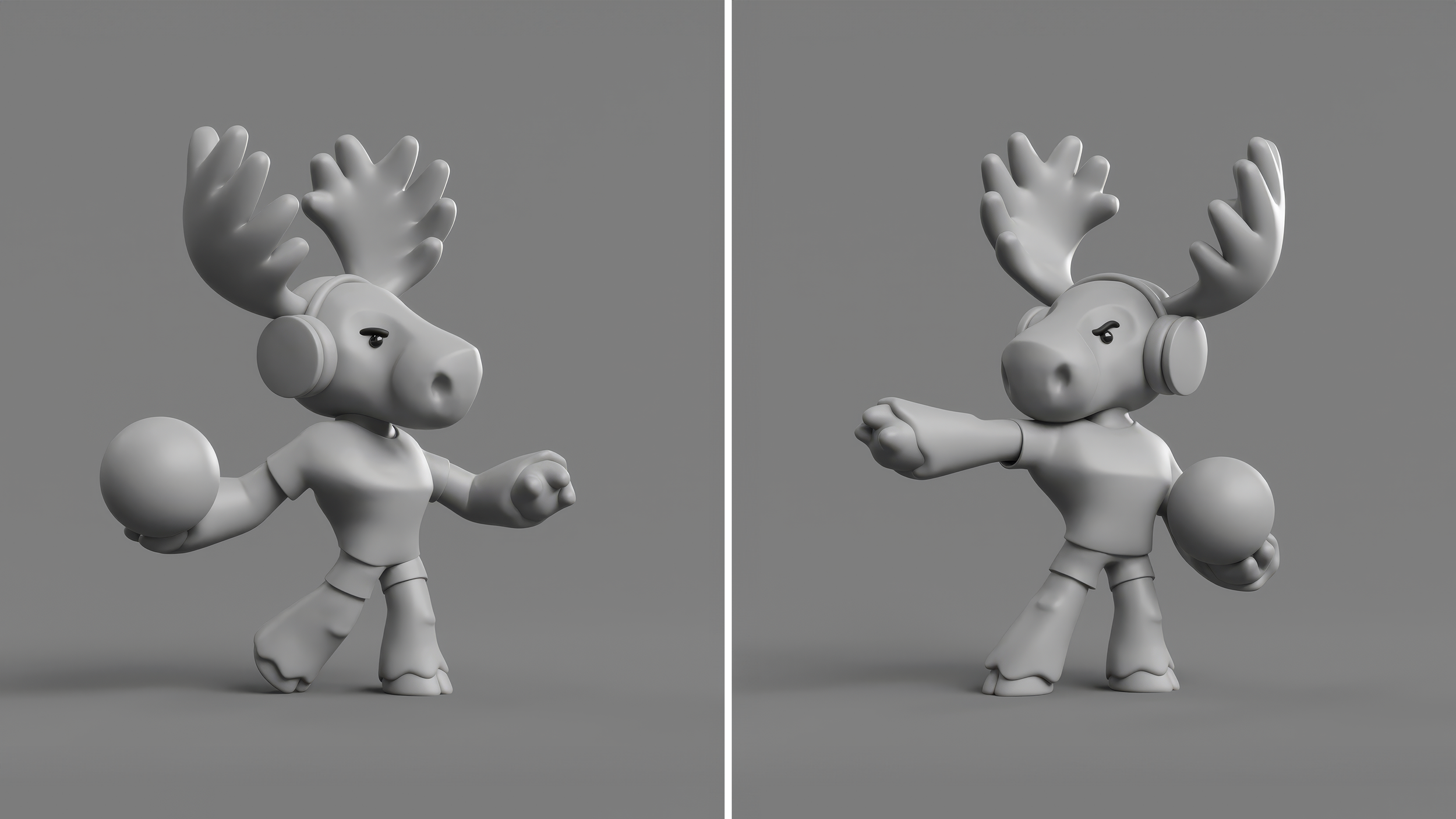
USA: Wilder the buffalo
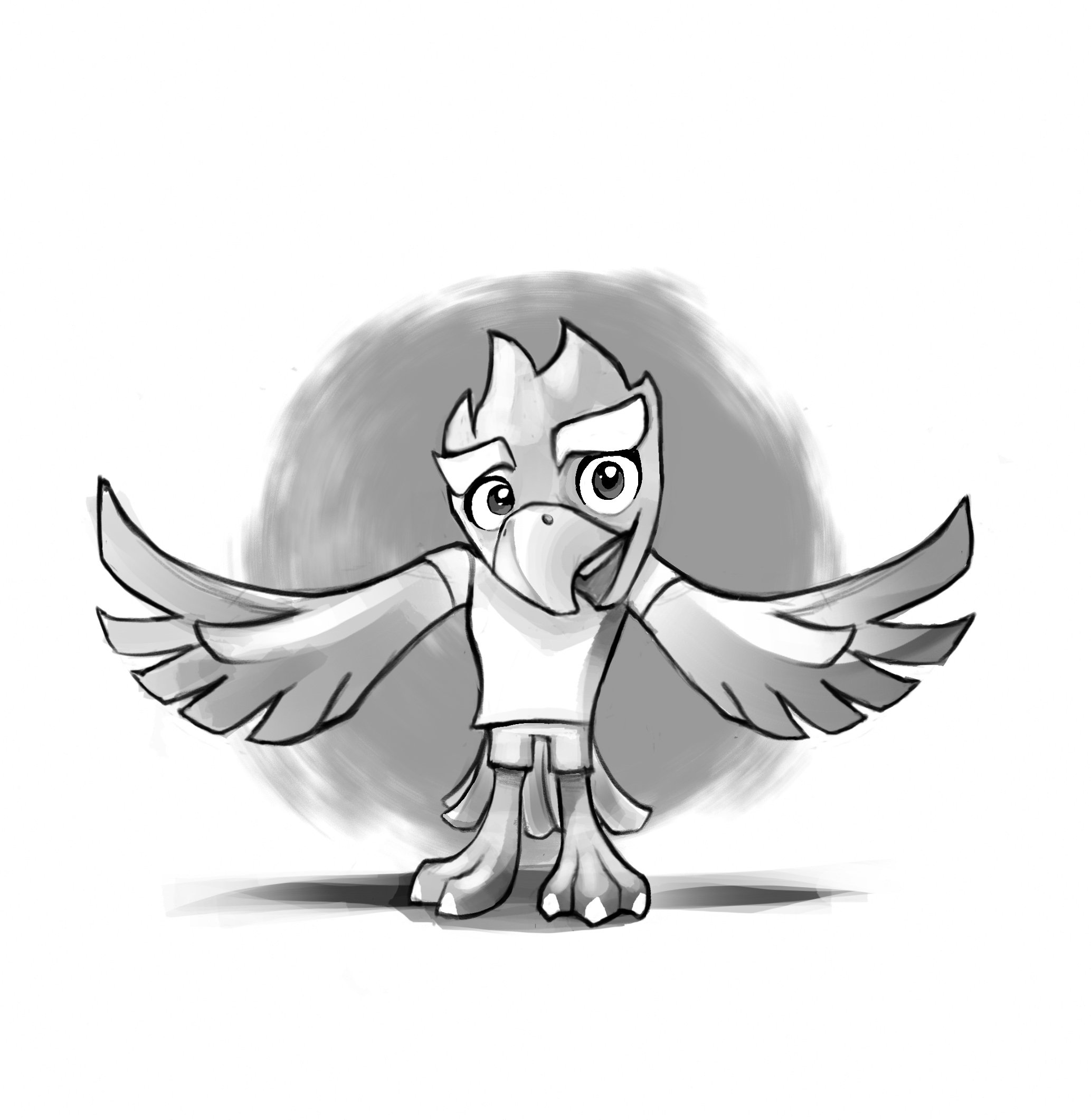
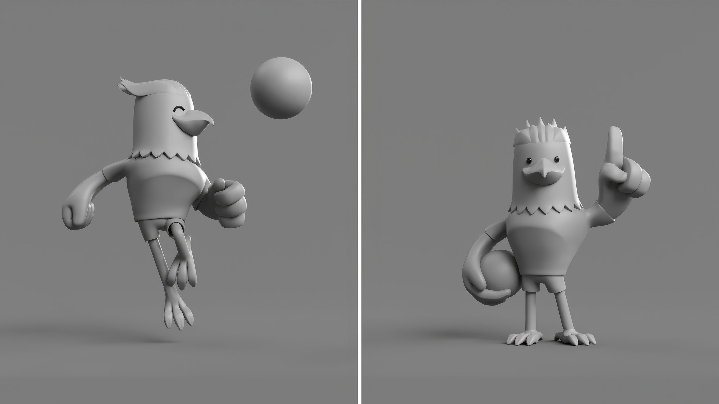
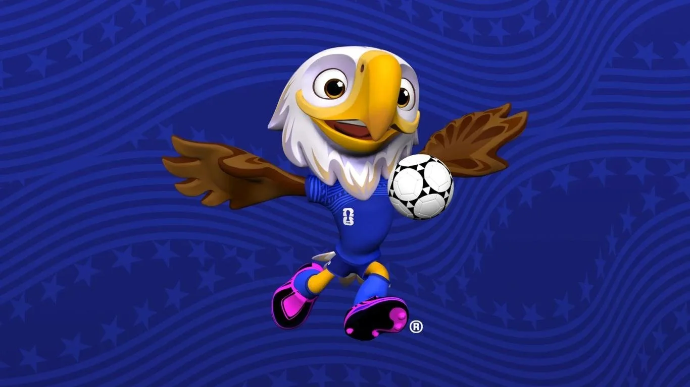
MEXICO: Texcoco the eagle
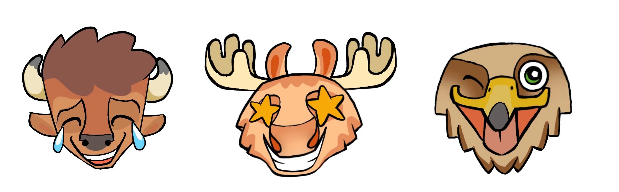
We did a ton of development on these characters - crafting expressions, proportions and overall design style - and pretty quickly they started to feel like a set.
BUFFALO R.I.P.
But in the high-stakes world of international diplomacy things rarely stay still for long.
Turns out our buffalo - a creature whose story is indelibly linked to the birth of the United States - wasn’t striking the right tone for the Americans. (They did… kill a lot of them.)
And besides. They still had their eyes on that eagle…
farewell
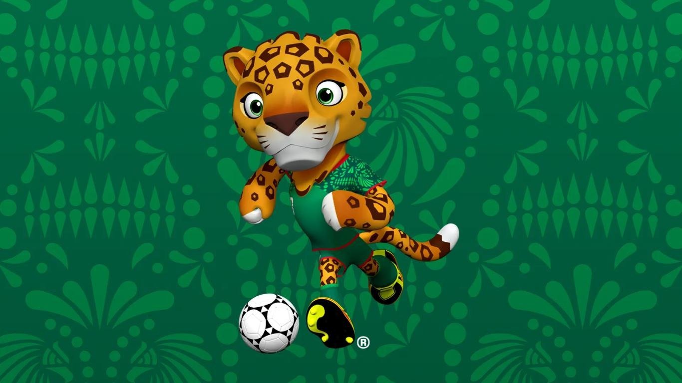
The animals were eventually redistributed. The moose stood fast as a Canadian icon, the US commandeered Mexico’s eagle (a move so rich in symbolism it feels like satire) and Mexico was awarded a jaguar in its place.
The unifying totem pole element teetered on the edge of existence. The client, as ever, unsure about wielding something so culturally powerful.
But by the time this was happening I was gone. The Mill was in free-fall and I had jumped to a new studio, seeking security for my incoming first-born. I hated abandoning this project before the final pieces were in place but… sometimes life gets in the way.
And thank god it does. I now have a beautiful son who will be as excited about these weird little animals as I once was.
Thanks to an incredible team: Bradley, Georgia, Ross, Silvia, Becca, Larisa, Rich and probably a few others I’ve forgotten.
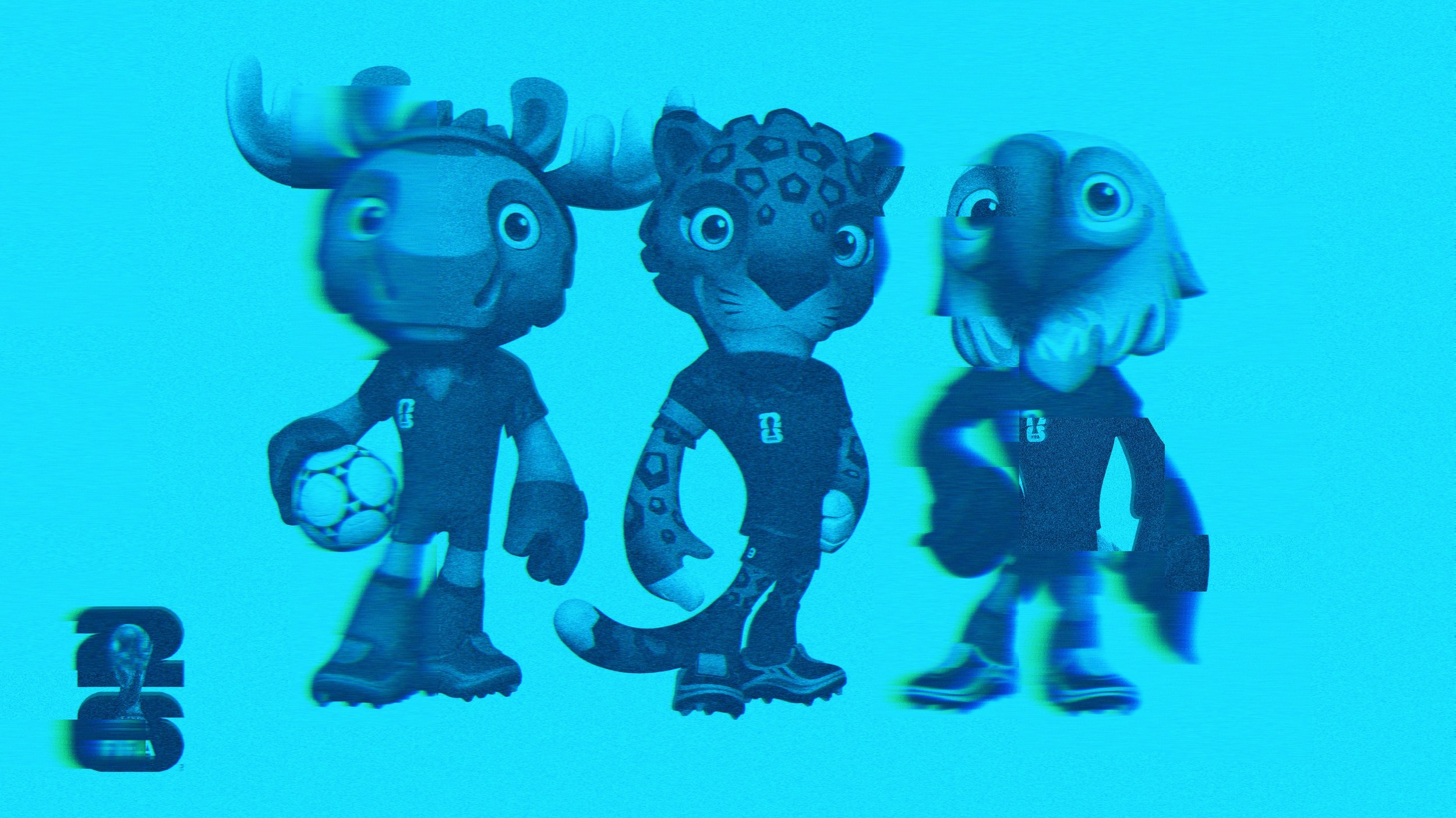
FIFA’S FINAL CHARACTERS
-
![]()
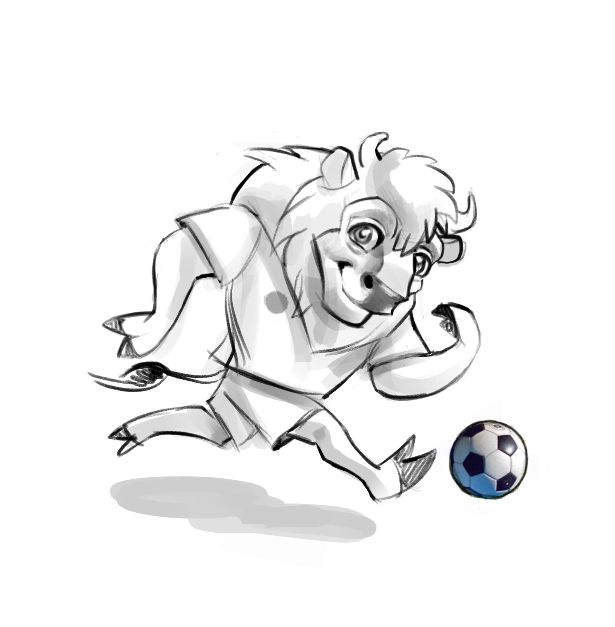
BUFFALO SKILLS
-
![]()
SPIRIT TOTEM
-
![]()
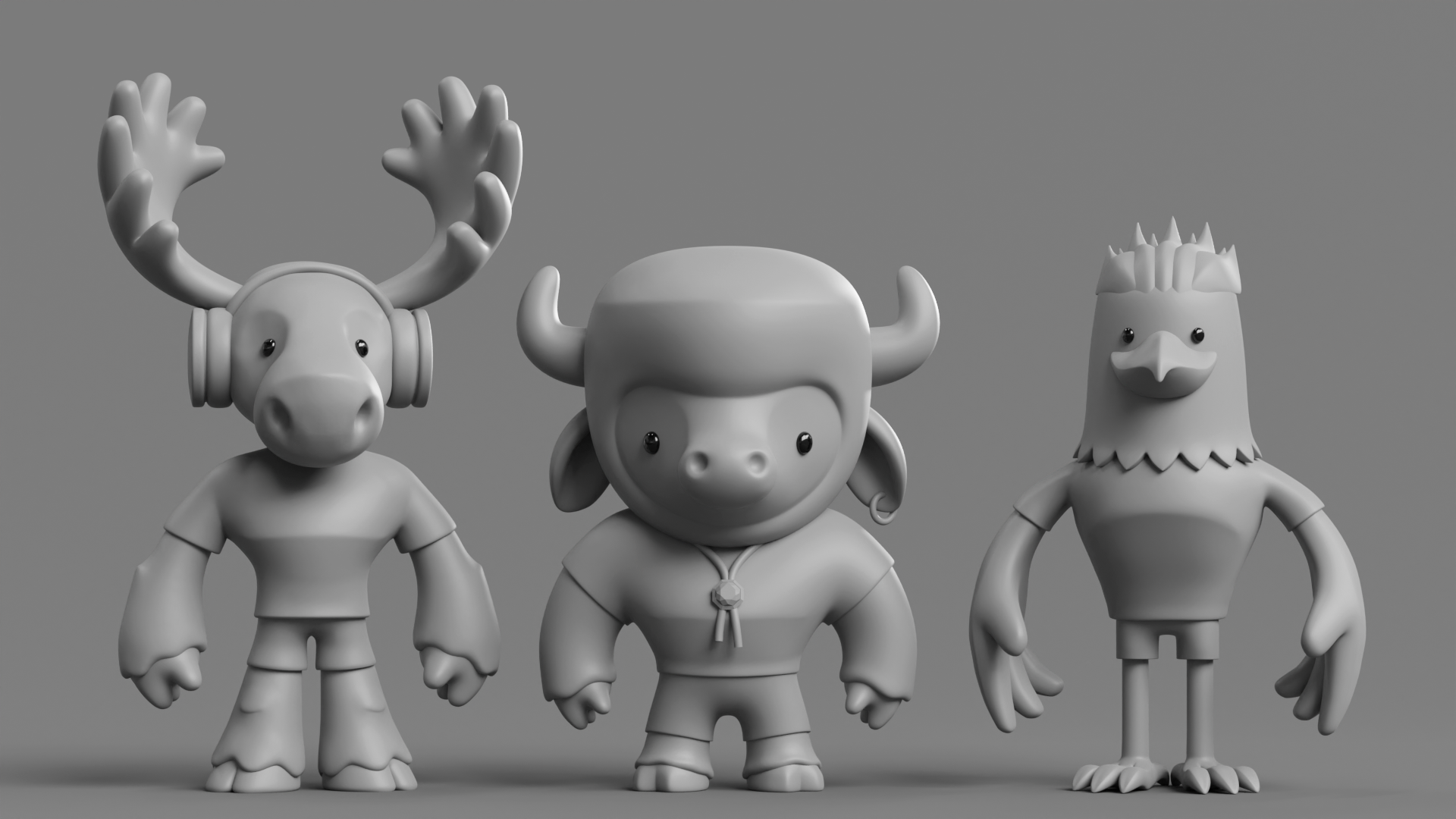
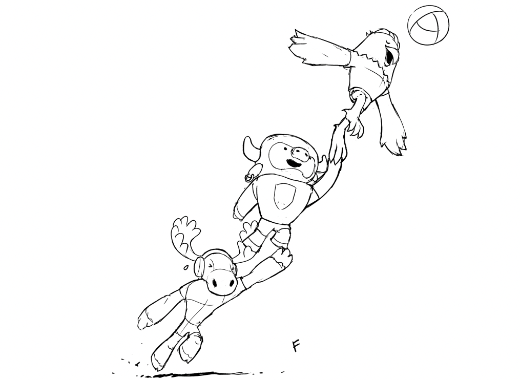
SQUAD WIP
-
![]()
CREW
-
![]()
TOTEM-ISH
-
![]()
ON THE MOVE
-
![]()
CUTER BUFFALO
-
![]()
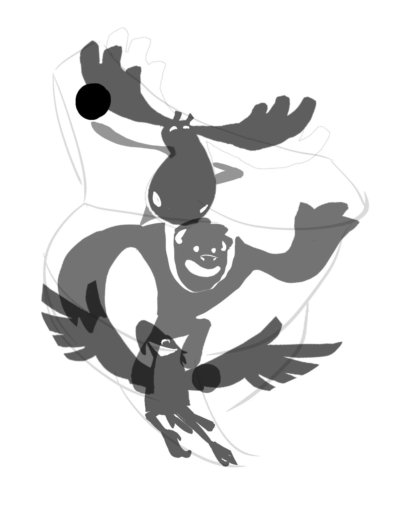
GANG SKETCH
-
![]()
EARLY BUFFALO
-
![]()
SPRUCE
-
![]()
WILDER
-
![]()
TEXCOCO
-
![]()
USA CONCEPT 01
-
![]()
USA CONCEPT 02
-
![]()
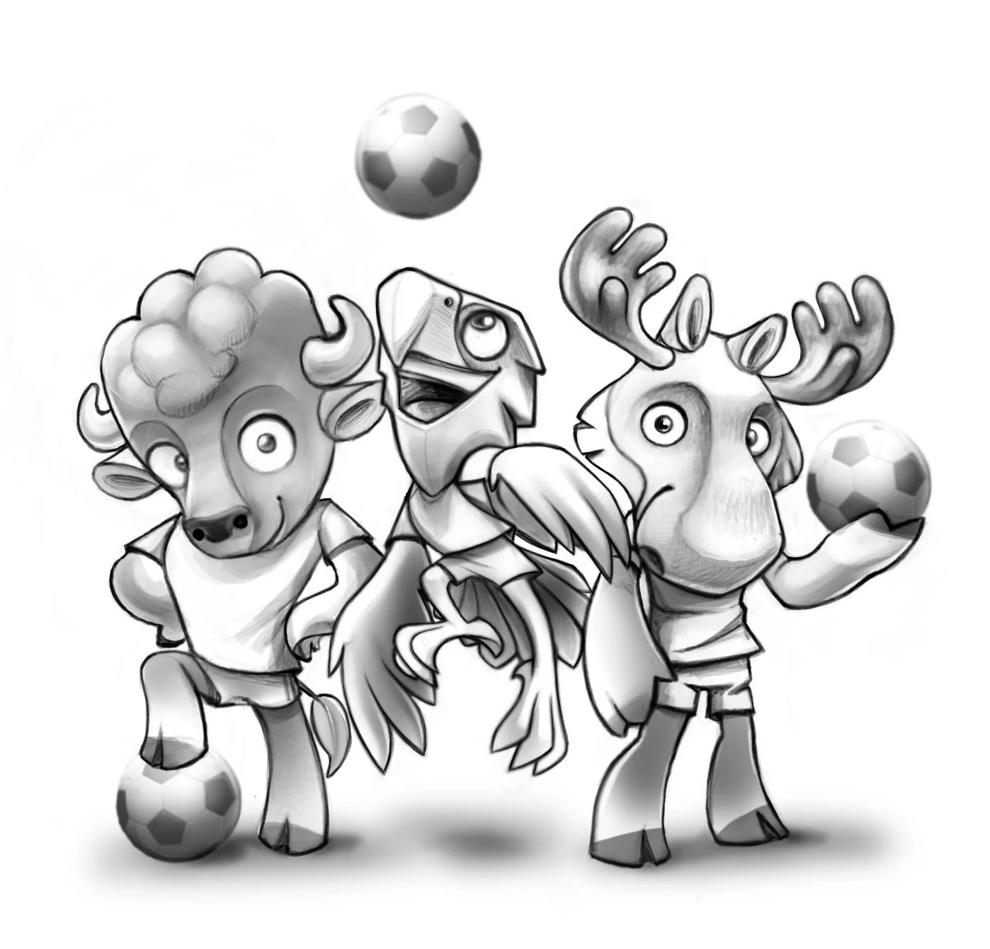
LINEUP